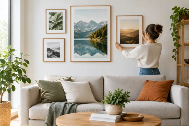
A print can look exceptional on a screen and still feel lost above a sofa, too busy in a reception area or oddly formal in a relaxed dining room. Choosing wall prints is less about finding a universally attractive photograph and more about matching subject, scale and presentation to the space in front of you.
For homes, offices, hospitality venues and commercial interiors, photography has a useful advantage: it can establish a sense of place without requiring an elaborate design scheme. A London skyline, a quiet coastal scene, a railway image or a panoramic landscape gives a room an immediate reference point. The best choice is usually specific rather than generic.
Start with the wall, not the image
Before searching by subject, assess the wall itself. Measure the available width and height, then consider the furniture or architectural feature below it. A small print centred over a large three-seat sofa will usually appear accidental. Equally, an oversized image in a narrow hallway can make the passage feel tighter.
As a working guide, a single framed print above furniture often looks balanced when it occupies around half to two-thirds of the furniture width. This is not a strict rule. A restrained image with wide borders may suit a more formal room, while a large panoramic print can deliberately dominate a long wall in a hotel lobby or boardroom.
Viewing distance matters as much as size. Fine documentary detail, crowded street scenes and event photography reward closer viewing. Broad landscapes, aerial views and horizon-led panoramas tend to read well from across a room. If people will see the image mainly while walking past, choose a composition that is clear at a glance.
Consider light before choosing a finish
Natural light changes throughout the day, and overhead lighting can create reflections on glazed prints. A bright, sun-facing room may benefit from a finish that reduces glare, while a darker interior can accommodate richer tones and stronger contrast. The right option depends on the available print and framing choices, but the principle remains simple: inspect where the picture will hang before deciding how it should be presented.
Colour should also respond to the room rather than match every cushion or chair. A photograph with one shared tone can tie into an existing scheme without becoming overly coordinated. Cool blue-grey coastal images often work in calm, contemporary interiors; warmer city scenes, autumn landscapes and historic architecture can bring weight to rooms with timber, brick or traditional furnishings.
Choose wall prints by purpose
A print for a private home and one for a business premises may be bought in the same way, but they do different jobs. Being clear about that job makes searching faster.
In a living room or bedroom, personal connection is usually the strongest filter. A place visited on holiday, a favourite city, a familiar stretch of coastline or an image linked to a sporting interest gives the room character. Decorative value matters, but an image that means something tends to remain satisfying long after a trend has passed.
In an office, meeting room or reception, the photograph should support the atmosphere you want visitors and staff to encounter. Cityscapes, transport, architecture and landscape photography can suggest scale, movement, local knowledge or calm. Avoid treating corporate walls as empty space that needs filling. One well-sized, well-positioned image often works harder than several unrelated small frames.
For hospitality settings, consider dwell time. Guests seated in a restaurant, lounge or hotel corridor have more opportunity to notice detail than people passing through a shop entrance. Local scenes and distinctive regional photography can create a stronger connection to the setting, particularly when the venue wants to feel rooted rather than interchangeable.
Select a subject with staying power
The subject category is a practical way to narrow a large picture library. It also helps prevent a familiar problem: choosing an image purely because it is dramatic, then finding it overwhelms the room.
City photography works well where structure and energy are wanted. London landmarks, European streets, bridges and railway scenes bring lines, texture and recognisable geography. They can suit contemporary homes, workspaces and visitor-facing areas, especially when the image has a strong perspective rather than a cluttered composition.
Landscape and wildlife images generally offer more visual breathing room. Coastlines, mountains, open countryside and seasonal scenes can soften hard-edged interiors and provide a useful contrast to screens, signage and office furniture. Their trade-off is that they can become predictable if chosen without attention to light, weather or composition. Look for an image with a clear focal point and a considered sense of depth.
Event, royal, military and sports photography brings a documentary quality that decorative art cannot easily replicate. These subjects are best used where relevance exists: a collector’s room, a club setting, a themed venue or an office with a clear connection to the event or place. They often prompt conversation, but a highly specific image can date a room more quickly than a timeless landscape.
Panoramic imagery deserves its own consideration. It is particularly effective above long furniture, in wide corridors and on feature walls where a standard landscape format would leave too much unused space. The risk is choosing a panorama simply because the wall is wide. The image still needs enough visual interest across its full length.
Build a layout when one print is not enough
A single large image is usually the simplest route. It is easier to position, gives the eye a clear resting point and makes a stronger statement in commercial spaces. Multiple prints can be equally effective, but they need a system.
A pair works best when the images have a deliberate relationship: two views of the same location, complementary details, or matched landscape scenes. A grid of four or six prints is useful for a corridor, stairwell or larger waiting area, particularly if the collection follows one subject such as transport, British landmarks or coastal photography.
Keep frame finishes, margins and spacing consistent. The photographs do not need identical colours, but they should share a visual logic. Mixed formats can work in a more informal home setting, yet a reception or hospitality interior normally benefits from greater order.
When planning a group, lay out paper templates on the wall first. This takes minutes and prevents the common mistake of hanging the arrangement too high or leaving gaps that feel uneven. The centre of the overall grouping, rather than each individual frame, should relate to normal eye level.
Check the practical details before you buy
A good photograph cannot compensate for an unsuitable size, unclear usage rights or a poorly considered location. Confirm the dimensions, orientation and intended display method before placing an order. Portrait orientation can solve a difficult narrow wall; landscape orientation usually suits space above sideboards, sofas and beds; square images are useful where architectural symmetry is already present.
If the image is intended for a printed wall piece, buy it as wall art or confirm the supplier’s print options. A licence for an image file and a physical print are different purchases. A stock-image licence may permit publishing, advertising or digital use under stated terms, but it does not automatically provide a finished framed product. Conversely, purchasing a wall print does not normally grant the right to reproduce that photograph in marketing materials.
For teams sourcing both kinds of asset, keeping the purpose clear avoids delays. Prestige Pictures provides place-based and documentary photography for either route: license an image for publishing or commercial use, or select imagery intended to hang. This is particularly useful when a campaign and a physical space need related visual material without relying on a generic image subscription.
It is also worth checking whether a larger image size is available for a licensing project. Cropping, large-format production and multi-channel design all place different demands on a file. Starting with an image that has sufficient detail is more efficient than trying to enlarge a smaller version later.
Give the image room to do its job
The most effective wall art is rarely the busiest or most expensive-looking option. It is the image that suits the wall, holds up at the intended viewing distance and says something appropriate about the place it occupies. Choose the photograph with the room in mind, allow enough scale for it to be seen properly, and let a strong subject carry the space.