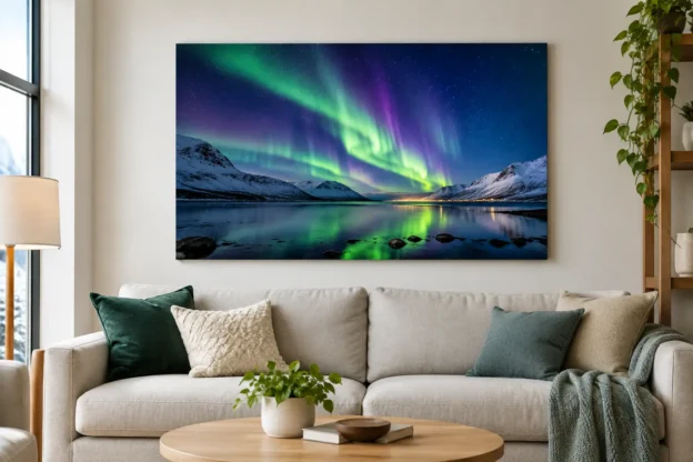
A successful northern lights print does more than add colour to a wall. It gives a room a clear focal point, whether that room is a quiet bedroom, a reception area or a hotel lounge. Aurora borealis wall art works particularly well because the subject combines a recognisable natural phenomenon with strong abstract qualities: shifting green, violet and blue light; dark water; snow-covered ground; and a wide night sky.
The best choice is rarely just the brightest image available. Size, composition, print finish and the setting all affect whether the final piece looks considered or simply decorative. For buyers sourcing photography for a home, workplace or commercial interior, it pays to treat the image as both a photograph and a design element.
Why Aurora Borealis Wall Art Has Lasting Appeal
The aurora has an immediate visual impact, but it is not tied to a short-lived interior trend. The subject sits comfortably alongside landscape photography, travel imagery and contemporary colour-led schemes. A distant glow above a Scandinavian fjord can feel calm and spacious. A vivid curtain of light over a dark mountain range has more energy and suits a larger, more dramatic setting.
Unlike a close-up wildlife image or a heavily themed seasonal print, northern lights photography usually gives the viewer room to look. There is often open sky, a low horizon and a sense of scale. That makes it useful where a wall needs presence without excessive visual clutter.
It also provides a practical way to introduce colour. Green aurora images can complement natural timber, charcoal, black and neutral interiors. Blue and violet tones work well with cooler, contemporary finishes. Photographs with a warmer foreground, perhaps reflected lights from a cabin or shoreline, can help the image sit more naturally in rooms with oak, brass or cream furnishings.
Choose the Image for the Room, Not Just the Subject
Start with the viewing distance. A print above a sofa, bed or boardroom table is normally viewed from several feet away, so a wide image with a clean horizon and a clear sweep of light is often the strongest option. In a hallway or narrow landing, a vertical composition can be more effective, especially where the aurora rises above trees, mountains or a single building.
The amount of foreground matters. An image made almost entirely of sky can create a modern, minimal effect, but it may feel too empty in a large public area. A foreground such as a lake, coast, road, woodland or mountain gives the eye somewhere to settle. It also establishes location, which is valuable for travel-focused interiors, visitor spaces and businesses with an international outlook.
Consider how much detail will remain visible at the intended print size. Fine stars, distant trees and reflections can look excellent in a large format, provided the source file has sufficient resolution. At a smaller size, those details may become secondary and the overall colour balance becomes more important.
For a domestic room, the image does not need to explain the full science of the aurora. It needs to work with the furniture, lighting and wall space. For a hotel, office or reception project, location and documentary value may carry more weight. A recognisable Icelandic, Norwegian, Scottish or Canadian scene can reinforce a travel theme and give visitors a useful point of conversation.
Match the Composition to the Available Wall
Panoramic aurora photographs suit wide, uninterrupted walls. They are a natural fit over a sideboard, long sofa, reception desk or set of low cabinets. Their horizontal format follows the room’s architecture and can make a modest wall appear broader.
A portrait-format print is more useful between windows, beside a fireplace or at the end of a corridor. Look for a composition with a strong vertical element, such as light rising through the frame, tall pines, a church spire or a steep mountain edge. A square print offers a balanced option for smaller walls and works well where the image includes a central reflection.
Do not force a panoramic image into a square crop simply because square frames are available. The loss of open sky or landscape context can weaken the photograph. It is generally better to select an image composed for the format required.
Scale and Print Finish Make the Difference
A common mistake is buying wall art that is too small. A print can look substantial on a product page, then disappear when placed above full-size furniture. As a working guide, art above a sofa or bed should usually occupy around two-thirds to three-quarters of the furniture width. This is not a fixed rule, but it prevents a single print from looking isolated.
Large aurora photography needs breathing room. Leave clear wall space around the frame where possible, rather than placing it among several small unrelated prints. If the aim is a gallery arrangement, use images with a shared treatment: similar frame colours, matching borders, or a coherent travel and landscape theme.
Finish affects the final character of the image. A gloss surface can intensify black skies and saturated greens, giving an aurora print a vivid, high-contrast appearance. It can also reflect windows and overhead lighting, which is not ideal opposite a bright window or in a strongly lit office.
A matte or lustre finish is usually more forgiving in everyday interiors. It reduces glare and gives subtle night-sky detail a more restrained appearance. Framed prints add structure and suit traditional homes, meeting rooms and hospitality spaces. Frameless acrylic or metal-style presentations can suit modern commercial settings, but they should be chosen with the lighting plan in mind.
Colour, Lighting and Placement
Aurora imagery contains strong colour, yet it is often easier to place than a print with many competing hues. Pull one secondary colour from the photograph into the room rather than trying to match every tone. A deep green cushion, blue-grey rug or dark timber shelf may be enough to make the piece feel integrated.
Wall colour changes the result. Against white or pale grey, an aurora print becomes a crisp focal point. On a dark navy, charcoal or forest-green wall, the same photograph can feel more immersive, although a frame with a light mount may be needed to define its edge. In rooms with patterned wallpaper, choose a simpler image with a clear sky and limited foreground detail.
Lighting deserves equal attention. Direct spotlights can create glare on glossy surfaces and flatten darker areas of the image. Indirect light or adjustable picture lighting gives better control. In hospitality settings, view a sample or proof under the lighting used after dusk, not only in daylight. Northern lights photography is designed around darkness, and that character can change significantly under warm interior lamps.
Buying Photography for Display and Publication
A wall art purchase and a stock image licence are different transactions with different uses. A print is intended for display. It should not automatically be scanned, reproduced in brochures, used on a website or incorporated into advertising. Businesses that need the same aurora image for printed wall art and marketing materials should confirm the appropriate licensing route for each use.
This matters for designers working across interiors, brochures, social media and visitor information. Choosing one strong image can create visual continuity, but the rights for reproduction must match the project. Editorial use may also have restrictions that differ from commercial promotional use, especially where a photograph includes identifiable property, people or event content.
When sourcing a file for a large-format print, ask about the available image size before making assumptions. A larger original file can make a material difference to sharpness, particularly for panoramic installations. Prestige Pictures supplies licensed photography without a subscription requirement and can provide larger image sizes on request, which is useful when a chosen image has both display and publishing value.
Avoid the Usual Selection Errors
Do not judge a northern lights photograph only by saturation. Extremely bright green skies can be effective, but they may overpower a small room or clash with existing colours. A quieter image with a soft band of light often has more flexibility and can remain attractive after the rest of the décor changes.
Avoid placing a dark, detail-heavy scene in a poorly lit corner unless the intention is deliberately atmospheric. Likewise, do not select a highly reflective finish for a wall facing floor-to-ceiling glazing. The image may be technically excellent but difficult to see for much of the day.
Finally, check the photograph at a realistic crop and ratio. The strongest part of an aurora scene is often the relationship between sky and land. If framing removes the reflection, mountain ridge or foreground that gives the image scale, it may no longer have the same effect.
A good northern lights print should suit the space before it impresses the viewer. Measure the wall, consider the room’s lighting, select a composition that works at the required format, and let the photograph provide the atmosphere rather than compete with everything around it.