Best Images for Tourism Brochures That Sell

Best Images for Tourism Brochures That Sell

A tourism brochure has a short window to make a place feel worth the journey. The best images for tourism brochures do more than show a landmark: they give a prospective visitor a clear sense of what they can see, do and feel once they arrive. A well-chosen photograph can turn a generic destination into a specific, bookable experience.

For destination marketers, accommodation providers, visitor attractions and travel publishers, image selection is not simply a design task. It affects credibility, audience fit and the commercial usefulness of every page. The right image should work at brochure size, support the accompanying copy and remain suitable for the intended licence.

Start with the visitor decision

Choose photography according to the decision the reader needs to make. Someone considering a city break wants evidence of atmosphere, walkability, food, culture and places to stay. A family planning a school-holiday break may need to see open space, activities, accessible facilities and children enjoying themselves. A brochure aimed at international visitors may need recognisable landmarks alongside images that explain the character of the wider area.

Avoid treating every destination as a postcard. A single skyline or famous building can establish location, but it rarely tells a complete tourism story. Pair signature views with usable detail: a market in progress, a coastal path, a historic street, a museum interior, a local event or a view from a transport route. These images help people picture an itinerary rather than merely admire a scene.

The key question is simple: does this picture answer a visitor’s practical or emotional reason for travelling? If it does neither, it may be attractive but not effective brochure material.

Best images for tourism brochures: build a balanced set

A strong brochure usually needs a small, varied group of images rather than repeated versions of the same view. Balance helps a destination feel substantial and helps the layout stay visually interesting across print and digital formats.

Use one clear hero image

The cover image must identify the destination quickly and create a reason to open the brochure. It should have a strong focal point, enough uncluttered space for typography and a composition that still works when cropped. Panoramic scenes can be effective for spreads, while a vertical image may suit a folded cover or mobile-led digital version.

A hero image should not try to show everything. A misty mountain, lively waterfront, illuminated city square or striking heritage building can establish a mood. The interior pages can do the explanatory work.

Show people with a purpose

People bring scale, warmth and proof of experience. They are particularly useful when the activity is central to the offer: walking, cycling, sightseeing, dining, attending a festival or enjoying a beach. Natural-looking scenes are generally more persuasive than posed groups staring at the camera.

However, people photography has trade-offs. A crowded scene can date quickly, distract from the setting or make a quiet destination appear too busy. It also requires careful licensing. Images featuring recognisable individuals may need model releases for promotional or commercial use. Editorial images can be valuable for publication-led content, but they are not automatically suitable for advertising a destination, attraction or accommodation business.

Include the details that make a place distinct

Close-up images often earn their place in a brochure because they give the design rhythm and specificity. Consider local food, craft, architectural textures, signage, wildlife, seasonal colour, transport or historic details. These supporting images are useful beside short copy blocks and can reinforce a theme without repeating the main view.

A photograph of a London red bus, a European café terrace, a heritage railway carriage or a coastal wildflower scene may be more memorable in context than another wide landscape. The detail must still be genuinely connected to the visitor experience, not a decorative filler.

Represent the season honestly

Seasonality is part of the product. A summer image may be ideal for a holiday guide focused on outdoor events, but it can set the wrong expectation for a year-round campaign. If the destination is appealing in autumn, winter and spring, show that range where space allows.

This does not mean every brochure needs four seasons. It means the photography should support the dates, activities and weather conditions being promoted. A Christmas market, spring garden or autumn walking route has a clear use. A bright July beach image in a brochure advertising an October break may be less helpful unless it is clearly presented as part of a wider seasonal collection.

Prioritise authenticity over generic travel imagery

Generic travel photographs are easy to recognise. They often show polished but interchangeable scenes that could belong almost anywhere. For tourism marketing, location-specific imagery usually performs better because it reduces uncertainty. Readers can see what makes the destination different and whether it matches their interests.

Documentary-style photography has particular value here. It can show real streets, public events, transport, sporting occasions and local life with a sense of place that staged imagery rarely achieves. This is especially useful for editorial guides, cultural programmes and regional campaigns where credibility matters as much as aspiration.

Authenticity does not require poor lighting or untidy composition. It means showing a believable experience. If a promenade is busy in peak season, an empty dawn shot may be beautiful but incomplete. If tranquillity is a selling point, then a calm off-season scene may be exactly right. The choice depends on the audience and promise being made.

Check composition before choosing the photograph

An image can be technically excellent and still fail in a brochure layout. Before licensing, check where headings, captions, logos and calls to action will sit. Images with clean sky, water, walls or other quieter areas often give designers room to work. A tightly framed image with important detail at every edge can become unusable once cropped.

Resolution matters as well. A file suitable for a social post may not reproduce cleanly across a double-page spread or large print run. Request dimensions appropriate to the final use, including bleed and possible alternate crops. Prestige Pictures can provide larger image sizes on request without an additional size charge, which can remove a common obstacle when a brochure moves from a draft layout to print production.

Also consider orientation. Select a mix of landscape, portrait and square-capable images if the campaign will appear in print, email, social channels and on a website. One versatile image is useful, but forcing every format from one crop often weakens the result.

Licence for the actual use, not the hoped-for use

Tourism brochures frequently cross the line between editorial and commercial communication. A visitor guide published as editorial content may have different requirements from a brochure promoting ticket sales, hotel stays or package holidays. The placement, audience, distribution and wording around the image all matter.

Check whether the image contains recognisable people, private property, artworks, branded elements or protected locations. A photograph taken at a public event may be ideal for a news feature but unsuitable for a paid advertisement without the relevant permissions. When in doubt, confirm the licence before finalising the design rather than replacing imagery at the last minute.

Pay-per-image sourcing can be practical for campaigns with a defined image list. It allows buyers to select the exact views they need without committing to a subscription that encourages unnecessary downloads. Keep a simple record of file names, licence details, usage dates and approved crops so the asset can be managed properly across future editions.

Plan image selection around the brochure journey

Think in pages, not isolated pictures. The cover should attract attention; opening spreads should establish place; middle sections should show things to do, where to stay and how to get around; final pages should make the next action easy. This sequence prevents the common problem of using all the strongest images at the beginning and leaving later sections visually thin.

For a compact brochure, fewer well-selected images are often stronger than a crowded gallery. Give each photograph enough space to communicate. If a view needs a long caption to explain why it matters, consider whether another image would make the message clearer.

The most effective tourism photography makes the journey feel possible. Choose images that are recognisable, relevant, properly licensed and designed to work in the space available. When readers can imagine themselves there, the brochure has done its job.
Aurora Borealis Wall Art for Every Room

Aurora Borealis Wall Art for Every Room

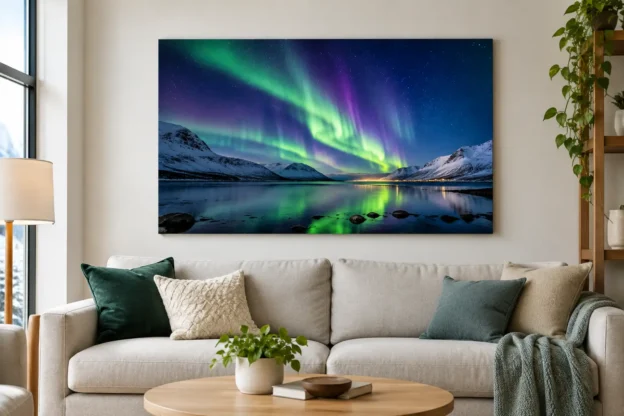
A successful northern lights print does more than add colour to a wall. It gives a room a clear focal point, whether that room is a quiet bedroom, a reception area or a hotel lounge. Aurora borealis wall art works particularly well because the subject combines a recognisable natural phenomenon with strong abstract qualities: shifting green, violet and blue light; dark water; snow-covered ground; and a wide night sky.

The best choice is rarely just the brightest image available. Size, composition, print finish and the setting all affect whether the final piece looks considered or simply decorative. For buyers sourcing photography for a home, workplace or commercial interior, it pays to treat the image as both a photograph and a design element.

Why Aurora Borealis Wall Art Has Lasting Appeal

The aurora has an immediate visual impact, but it is not tied to a short-lived interior trend. The subject sits comfortably alongside landscape photography, travel imagery and contemporary colour-led schemes. A distant glow above a Scandinavian fjord can feel calm and spacious. A vivid curtain of light over a dark mountain range has more energy and suits a larger, more dramatic setting.

Unlike a close-up wildlife image or a heavily themed seasonal print, northern lights photography usually gives the viewer room to look. There is often open sky, a low horizon and a sense of scale. That makes it useful where a wall needs presence without excessive visual clutter.

It also provides a practical way to introduce colour. Green aurora images can complement natural timber, charcoal, black and neutral interiors. Blue and violet tones work well with cooler, contemporary finishes. Photographs with a warmer foreground, perhaps reflected lights from a cabin or shoreline, can help the image sit more naturally in rooms with oak, brass or cream furnishings.

Choose the Image for the Room, Not Just the Subject

Start with the viewing distance. A print above a sofa, bed or boardroom table is normally viewed from several feet away, so a wide image with a clean horizon and a clear sweep of light is often the strongest option. In a hallway or narrow landing, a vertical composition can be more effective, especially where the aurora rises above trees, mountains or a single building.

The amount of foreground matters. An image made almost entirely of sky can create a modern, minimal effect, but it may feel too empty in a large public area. A foreground such as a lake, coast, road, woodland or mountain gives the eye somewhere to settle. It also establishes location, which is valuable for travel-focused interiors, visitor spaces and businesses with an international outlook.

Consider how much detail will remain visible at the intended print size. Fine stars, distant trees and reflections can look excellent in a large format, provided the source file has sufficient resolution. At a smaller size, those details may become secondary and the overall colour balance becomes more important.

For a domestic room, the image does not need to explain the full science of the aurora. It needs to work with the furniture, lighting and wall space. For a hotel, office or reception project, location and documentary value may carry more weight. A recognisable Icelandic, Norwegian, Scottish or Canadian scene can reinforce a travel theme and give visitors a useful point of conversation.

Match the Composition to the Available Wall

Panoramic aurora photographs suit wide, uninterrupted walls. They are a natural fit over a sideboard, long sofa, reception desk or set of low cabinets. Their horizontal format follows the room’s architecture and can make a modest wall appear broader.

A portrait-format print is more useful between windows, beside a fireplace or at the end of a corridor. Look for a composition with a strong vertical element, such as light rising through the frame, tall pines, a church spire or a steep mountain edge. A square print offers a balanced option for smaller walls and works well where the image includes a central reflection.

Do not force a panoramic image into a square crop simply because square frames are available. The loss of open sky or landscape context can weaken the photograph. It is generally better to select an image composed for the format required.

Scale and Print Finish Make the Difference

A common mistake is buying wall art that is too small. A print can look substantial on a product page, then disappear when placed above full-size furniture. As a working guide, art above a sofa or bed should usually occupy around two-thirds to three-quarters of the furniture width. This is not a fixed rule, but it prevents a single print from looking isolated.

Large aurora photography needs breathing room. Leave clear wall space around the frame where possible, rather than placing it among several small unrelated prints. If the aim is a gallery arrangement, use images with a shared treatment: similar frame colours, matching borders, or a coherent travel and landscape theme.

Finish affects the final character of the image. A gloss surface can intensify black skies and saturated greens, giving an aurora print a vivid, high-contrast appearance. It can also reflect windows and overhead lighting, which is not ideal opposite a bright window or in a strongly lit office.

A matte or lustre finish is usually more forgiving in everyday interiors. It reduces glare and gives subtle night-sky detail a more restrained appearance. Framed prints add structure and suit traditional homes, meeting rooms and hospitality spaces. Frameless acrylic or metal-style presentations can suit modern commercial settings, but they should be chosen with the lighting plan in mind.

Colour, Lighting and Placement

Aurora imagery contains strong colour, yet it is often easier to place than a print with many competing hues. Pull one secondary colour from the photograph into the room rather than trying to match every tone. A deep green cushion, blue-grey rug or dark timber shelf may be enough to make the piece feel integrated.

Wall colour changes the result. Against white or pale grey, an aurora print becomes a crisp focal point. On a dark navy, charcoal or forest-green wall, the same photograph can feel more immersive, although a frame with a light mount may be needed to define its edge. In rooms with patterned wallpaper, choose a simpler image with a clear sky and limited foreground detail.

Lighting deserves equal attention. Direct spotlights can create glare on glossy surfaces and flatten darker areas of the image. Indirect light or adjustable picture lighting gives better control. In hospitality settings, view a sample or proof under the lighting used after dusk, not only in daylight. Northern lights photography is designed around darkness, and that character can change significantly under warm interior lamps.

Buying Photography for Display and Publication

A wall art purchase and a stock image licence are different transactions with different uses. A print is intended for display. It should not automatically be scanned, reproduced in brochures, used on a website or incorporated into advertising. Businesses that need the same aurora image for printed wall art and marketing materials should confirm the appropriate licensing route for each use.

This matters for designers working across interiors, brochures, social media and visitor information. Choosing one strong image can create visual continuity, but the rights for reproduction must match the project. Editorial use may also have restrictions that differ from commercial promotional use, especially where a photograph includes identifiable property, people or event content.

When sourcing a file for a large-format print, ask about the available image size before making assumptions. A larger original file can make a material difference to sharpness, particularly for panoramic installations. Prestige Pictures supplies licensed photography without a subscription requirement and can provide larger image sizes on request, which is useful when a chosen image has both display and publishing value.

Avoid the Usual Selection Errors

Do not judge a northern lights photograph only by saturation. Extremely bright green skies can be effective, but they may overpower a small room or clash with existing colours. A quieter image with a soft band of light often has more flexibility and can remain attractive after the rest of the décor changes.

Avoid placing a dark, detail-heavy scene in a poorly lit corner unless the intention is deliberately atmospheric. Likewise, do not select a highly reflective finish for a wall facing floor-to-ceiling glazing. The image may be technically excellent but difficult to see for much of the day.

Finally, check the photograph at a realistic crop and ratio. The strongest part of an aurora scene is often the relationship between sky and land. If framing removes the reflection, mountain ridge or foreground that gives the image scale, it may no longer have the same effect.

A good northern lights print should suit the space before it impresses the viewer. Measure the wall, consider the room’s lighting, select a composition that works at the required format, and let the photograph provide the atmosphere rather than compete with everything around it.

What Makes a Publisher Friendly Stock Image Platform?

What Makes a Publisher Friendly Stock Image Platform?

A publisher friendly stock image platform should remove friction at the point where deadlines are tight and the picture desk needs a usable file. That means relevant search results, clear licensing, sensible pricing and image sizes that work for print as well as digital publishing. It should not require a monthly commitment simply to obtain one strong, properly licensed photograph.

For publishers, marketers and designers, the right image is rarely just decorative. It may establish a location, support a reported event, give an article historical context or provide a recognisable visual for a campaign. The value lies in being able to find that image quickly, understand what it can be used for and purchase it without unnecessary negotiation.

What publishers need from a stock image library

A large library is useful only when its content can be found. Broad search functions are helpful for general subjects, but specialist collections matter when the brief calls for a particular place, event or type of scene. A feature on London, for example, needs more than a generic skyline. It may need a specific landmark, a seasonal street scene, public transport, an event, a neighbourhood or an image that reflects a particular period.

This is where documentary-led stock photography has an advantage. Images of cities, travel, sport, royal occasions, transport, military subjects, wildlife and seasonal events can serve editorial teams that need specificity rather than another interchangeable business photograph. Location-based galleries and clearly arranged themes reduce the time spent refining searches and opening unsuitable files.

A useful library also recognises that one buyer may have several jobs. A magazine editor may need an editorial image for a feature, while a marketing team requires an image for a brochure and an interior designer needs an enlarged print for a reception area. The same well-made photograph can have different commercial uses, provided the purchase route and licence are clear.

Clear licences are part of the product

Licensing should be easy to understand before checkout, not after publication. Buyers need to know whether an image is suitable for editorial use, commercial promotion, websites, social media, printed material or advertising. Where intended use falls outside a standard licence, there should be a clear route to ask rather than vague wording that leaves the buyer to interpret legal terms alone.

Editorial use and commercial use are not interchangeable. An image of a public event may be ideal for a news article, book, educational publication or factual feature, but it may not be appropriate for an advert implying endorsement. Similarly, a photograph containing logos, private property or recognisable people may require additional consideration depending on how it will be used.

The practical approach is to confirm the planned use early. Ask three direct questions: where will the image appear, how long will it be used and is it supporting editorial content or promoting a product or service? A reputable supplier can then point the buyer towards the appropriate licence or explain any limitation before money is spent.

No subscription should not mean less choice

Subscription services suit organisations that download high volumes of generic imagery every month. They are less appealing for buyers who need a handful of distinctive images at irregular intervals. A publisher working on a quarterly title, a local history book or a single travel supplement should not have to maintain a recurring plan just to access one relevant photograph.

Pay-per-image purchasing gives occasional and specialist buyers more control. Costs are connected to actual requirements, and there is no unused allowance to chase before the end of a billing period. It is also easier to attribute an image cost to a particular issue, campaign or client project.

There is a trade-off. If a large marketing department needs hundreds of broad, studio-produced assets every month, a subscription can be more economical. But for place-based, event-led and documentary material, the quality of the individual search result often matters more than the volume available under a plan.

Image size must match the finished job

A web thumbnail, an A4 magazine page and a large framed print do not need the same file. Buyers should be able to select an appropriate size without paying for a file that is too small for print or too large for the intended use. Confusion over dimensions can cause avoidable delays, particularly when a publication has already reached layout stage.

A publisher friendly stock image platform should state file information clearly and make larger sizes available when the project demands them. Larger files are particularly relevant for double-page spreads, book covers, exhibition panels, display graphics and wall art. The buyer should not discover at the last minute that the chosen photograph cannot reproduce cleanly at the required scale.

Resolution is only one part of the decision. Composition matters as much. A horizontal panorama may be excellent for a website banner or framed print but unsuitable for a vertical cover. A tightly framed event photograph may support a news page, while a wider scene provides useful space for headlines, captions or copy. Viewing images at a meaningful preview size helps editors make these choices before download.

Specialist subjects make sourcing faster

General stock sites can be effective when the brief is broad. They become slower when the brief is precise: an Australian coastal scene, a European city square, London transport, a royal event, a sporting occasion, a festive display or a British military subject. Search results may contain thousands of loosely related files, with little indication of whether the photograph has the right place, date or context.

A specialist archive brings subject knowledge to the catalogue. Organised galleries allow buyers to browse by location, event and theme, rather than relying on keywords alone. This is particularly useful for picture researchers who know the visual direction they want but need to compare several authentic options.

Prestige Pictures is built around this practical model, offering licensed photography across travel, editorial, events, landscapes and themed subjects, alongside wall art prints. The principle is straightforward: licence to publish, or choose an image to hang. Buyers can source a focused image without subscription lock-in and request larger sizes where required.

A practical buying process saves more than time

The most efficient purchase process is usually uncomplicated. Find the image, check its subject and orientation, select the required licence and size, then retain the purchase details with the project records. Those records matter when a publication is updated, a campaign is renewed or a client asks where an image came from.

For teams, it helps to establish a small internal process. Keep the image ID, licence terms, publication date and intended placement together. If a file is cropped, edited or reused, check that the licence permits the planned treatment. This does not need to become a lengthy approval system, but it avoids the common problem of images being reused long after the original permissions have been forgotten.

Speed should not come at the expense of judgement. A fast search is valuable, but a file should still be checked for visual accuracy, relevance and rights considerations. For editorial work especially, captions and surrounding text should not suggest facts that the photograph does not support.

Choosing the right platform for the brief

The best choice depends on the work in hand. A high-volume content operation may prioritise quantity, integrations and predictable monthly spend. A publisher, designer or business looking for distinctive UK, European or international imagery may place more value on curated subjects, direct purchasing and access to a larger file when needed.

Before selecting a supplier, test it against a real brief. Search for a specific location and event, not merely a broad term. Check whether the results look authentic, whether the licence is understandable and whether the file will work at the intended size. Also consider whether the platform offers useful alternatives when the first image is close but not quite right.

The right photograph should earn its place on the page, screen or wall. Choose a library that makes it simple to find an image with real context, secure the correct rights and obtain a file fit for the finished work.

How to Use Travel Photos for Work and Wall Art

How to Use Travel Photos for Work and Wall Art

A strong travel photograph does more than show a place. It gives a reader a sense of location, gives a campaign credibility, or gives a room a focal point. Knowing how to use travel photos starts with deciding what the image must do: report, promote, explain or decorate.

The same view of London, the Australian coast or a European railway station can suit several purposes, but not with the same crop, licence or output size. A publisher may need a horizontal editorial image with room for a headline. A hotel may need a large panoramic print that holds its detail at viewing distance. A business social post may need a vertical image that still reads clearly on a phone.

Start with the intended use

Choose images after defining the job, not before. A visually impressive photograph can still be the wrong choice if it cannot support the required format, audience or licensing terms.

For editorial use, prioritise accuracy and context. Images of recognisable streets, public events, transport, sporting occasions and seasonal scenes work well when they directly support the accompanying story. Look for details that establish place – signage, architecture, weather, local activity and a clear sense of scale. Avoid forcing an unrelated destination image into an article simply because it is attractive. Readers notice when the visual and the subject do not match.

For marketing, travel photography can establish atmosphere quickly. A city skyline can support a conference announcement, a coastal scene can introduce a hospitality offer, and a destination image can give a service business a more international feel. The image should still leave room for the message. A busy market, crowded landmark or tightly framed street scene may be compelling, but it can make text difficult to read.

For wall art, think less about a single screen-sized image and more about the room. A calm landscape can suit a reception area, while an energetic urban scene may be better for a creative studio, café or communal workspace. Subject, colour palette and orientation all affect whether a print belongs in the space.

How to use travel photos in publishing and promotion

Travel images are most effective when they earn their place on the page. Start by matching the subject to the message, then select a composition that works in the planned layout.

Leave space for copy and cropping

Designers often need usable negative space for headlines, logos, captions or calls to action. A photograph with an uncluttered sky, sea, pavement or wall can be more commercially useful than a tightly packed composition. Check where the focal point sits before adding text. Type placed over a face, landmark or busy foreground will weaken both the copy and the image.

Cropping should be planned early. A wide photograph may work across a website banner, but only if the central subject survives a narrower mobile crop. Likewise, a vertical image can be ideal for a poster, story format or full-page feature, but it may not suit a landscape newsletter header.

Use the original file wherever possible. Repeatedly downloading, compressing and resizing an image can reduce quality. Keep a master copy and create separate versions for web, social media, email and print. Name files clearly by location, subject and format so they can be found again without searching through generic file names.

Choose the correct image size

File size and image dimensions are not the same thing. For a website or social post, an image needs enough pixel dimensions to display sharply at its intended size, without being so large that it slows the page. For print, the required dimensions rise quickly as the physical output gets larger.

Before purchasing or licensing, establish the final use. Ask whether the photograph will appear in a small article thumbnail, a double-page spread, a large-format brochure or an exhibition display. Buyers should also consider whether a later crop is likely. Extra image area gives designers more flexibility around headlines, aspect ratios and print layouts.

Where a larger version is available on request, obtain it before production begins rather than trying to enlarge a smaller file afterwards. Artificial enlargement can be useful in limited cases, but it cannot recreate detail that was not present in the original photograph.

Keep edits honest and purposeful

Basic adjustments to brightness, contrast, colour balance and cropping are often part of normal production. The key question is whether the edit changes the meaning of the image. For documentary and editorial photography, heavy retouching, removing people or altering a scene can create a misleading result.

Promotional work allows more creative freedom, but consistency still matters. If a campaign uses multiple locations, apply a restrained, repeatable treatment so that one image does not appear cold and muted while the next is heavily saturated. A travel image should look considered, not over-processed.

Licence first, publish second

The right to view or buy a photograph is not automatically the right to use it in every context. Licensing defines what may be done with an image, including where it can appear, for how long, in which territory and in what type of publication or campaign.

Editorial images are commonly used to illustrate news, factual features, travel writing and commentary. They may contain recognisable people, properties, brands or events that make them unsuitable for broad commercial advertising without additional permissions. A photograph of a royal event, public sporting competition or busy street can be highly valuable for publishing, but its usage conditions must be checked before it is used to sell a product or service.

Commercial use usually requires more certainty around releases and permissions. If the image will promote a business, product, destination, offer or paid campaign, do not assume that an editorial licence covers it. Describe the intended use accurately when licensing the photograph. It is quicker to confirm the correct licence at the outset than to replace an image after artwork has been approved.

Keep a simple record of every licensed file: the image reference, supplier, date obtained, licence type, intended placement and any restrictions. This is particularly useful for teams producing regular newsletters, brochures, social content or client work. Prestige Pictures uses a pay-per-image approach, which can suit buyers who need a specific travel or location image without taking on a subscription commitment.

Use travel photography as wall art

Travel photographs can make commercial interiors feel more specific without becoming overly personal. A panoramic city view can give a boardroom a clear visual identity. A coastal landscape can soften a waiting area. Historic architecture, rail scenes and regional landmarks can connect a hotel, office or rental property to its location.

Select the print orientation to suit the wall rather than forcing the image to fit. Horizontal photographs generally work above sofas, beds, sideboards and reception seating. Vertical images can make effective use of narrow wall sections, stairways and corridors. Panoramas need room to breathe, so they are often best on a broad, uninterrupted wall.

Consider viewing distance as well. Fine architectural details reward close viewing, while bold landscapes and skylines tend to work from across a room. In high-traffic areas, choose images with a clear subject and enough contrast to hold attention under mixed lighting. For a calmer setting, softer tones and open compositions may be the better choice.

The frame and finish matter, but they should support the image rather than compete with it. A simple black, white or natural wood frame suits most travel photography. Gloss can add depth to richly coloured scenes, while a matte finish can reduce reflections in bright offices, restaurants and reception spaces. If several prints will hang together, use consistent framing even when the locations vary.

Build a useful image shortlist

When sourcing from a large library, broad searches can produce too many near-matches. Narrow the brief using place, subject, season, orientation and intended use. “London at night, horizontal, room for text” is a more efficient starting point than simply “London”. The same applies to searches for Europe, Australia, wildlife, transport or festive scenes.

Save a small working selection rather than choosing the first acceptable image. Compare photographs at the size they will actually be used. At thumbnail scale, a complex image may lose its impact. At print scale, an apparently simple image may reveal strong texture, depth and detail.

Travel photography works best when it is chosen with a clear purpose and used with the correct rights, format and finish. Give each image a defined job, and it will do more than fill a space – it will make the page, campaign or room more convincing.

Stock Photos Versus Commissioned Photography

Stock Photos Versus Commissioned Photography

A picture of a recognisable London street, a seasonal landscape or a major sporting occasion can be needed by the end of the day, not at the end of a production schedule. That is where the decision between stock photos versus commissioned photography becomes commercial rather than merely creative. Both can produce effective work. The right choice depends on how specific the brief is, how quickly the image is required and whether the subject already exists.

For publishers, marketers, designers and businesses, the practical question is simple: do you need to source a strong image now, or create an image that cannot be found anywhere else?

Stock photos versus commissioned photography: the practical difference

Stock photography is pre-existing imagery available to license for defined uses. A buyer searches a library, selects an image and purchases the appropriate licence. The photograph may cover locations, events, people, travel, wildlife, transport, architecture or seasonal subjects. It has already been photographed, edited and prepared for licensing.

Commissioned photography is created for a particular client and brief. The client may specify the location, people, product, lighting, angle, styling, timing and final applications. It gives much greater control, but it also requires planning, a photographer, production time and a budget that reflects the work involved.

Neither route is automatically better. A commissioned shoot is not always more useful simply because it is bespoke, and stock is not automatically generic because it is available to more than one buyer. A well-curated library can provide documentary images from places and events that would be difficult, expensive or impossible to recreate on demand.

When stock photography is the stronger option

Stock works best when speed, range and cost control matter more than total creative ownership. A publisher preparing an article on UK travel, a designer building a seasonal promotion or a hotel selecting scenic wall art may need several images across different subjects. Licensing existing photography is usually more efficient than arranging several shoots.

It is particularly useful for subjects that are time-sensitive or difficult to stage. Royal occasions, public events, historic locations, distinctive city views and weather-dependent landscapes cannot simply be recreated in a studio. If the moment has passed, access to an established image archive may be the only realistic route.

Stock also suits campaigns where the visual need is supportive rather than central. A social post, brochure, editorial feature, presentation or website page may need a relevant, professionally produced image without requiring a unique art direction. In these cases, paying per image keeps purchasing clear and avoids the cost of a shoot that exceeds the value of the asset.

For wall art buyers, the argument is equally practical. A panoramic coastline, urban skyline or wildlife image can bring character to an office, reception area, hospitality venue or home without arranging photography specifically for the space. The image has been selected because it stands on its own visually, not because it was made to satisfy a narrow campaign brief.

A pay-per-image model is helpful when image requirements are occasional or varied. There is no need to maintain a subscription merely to source a handful of photographs during the year. Buyers can search by location, event or theme, select the image they need and purchase it when the project is ready.

Stock’s limits

The main limitation is control. You can choose from what exists, but you cannot direct the weather, change the viewpoint or ask for a product to appear in the scene. The same image may also be licensed by other buyers, subject to the terms of its licence.

That does not make stock unsuitable for brand work. It simply means the selection process matters. Look beyond broad search terms and choose imagery with a distinctive point of view, a credible location and enough space for copy where required. Check orientation, crop potential, resolution and the licence before purchase.

When commissioning photography earns its cost

Commissioning is the right choice when the image must show something only your organisation can provide. This includes your people, premises, products, services, processes and brand experience. A manufacturer cannot use stock to demonstrate its own production line. A restaurant needs photographs of its actual dishes and dining room. A professional services firm may need authentic portraits of its team rather than models in a meeting room.

It is also worthwhile when consistency is essential. A brand refresh, national advertising campaign or long-term content programme may require a defined visual style across photography, video, social content and print. A commissioned photographer can work to a shot list and art direction, producing a coherent set of assets rather than individual images selected from different sources.

Commissioning gives greater certainty around exclusivity, subject matter and usage arrangements, provided these are agreed in writing. It can also be efficient when one planned shoot produces a large library of images for many months of activity. The initial spend may be higher, but the cost per usable asset can make sense for organisations with regular content demands.

Commissioning has hidden requirements

The shoot fee is only part of the cost. Depending on the brief, there may be location hire, travel, props, styling, assistants, talent, permits, retouching and usage fees. Internal time matters too. Someone must approve the brief, coordinate people and locations, review selects and ensure that the resulting images meet the original purpose.

Timing is another consideration. A simple portrait session can be arranged quickly, but an outdoor campaign involving several locations and people may take weeks to prepare. Weather, availability and permissions can all affect delivery. If an editorial deadline is fixed, a stock image can reduce risk considerably.

Compare the decision against the job, not the image

The most useful way to choose is to begin with the application. Ask what the photograph needs to prove, communicate or make possible.

If the image needs to document a real place, event or atmosphere, search stock first. A photograph of London in winter, European travel, transport heritage or a public celebration may already exist in a specialist archive at a standard that would be costly to reproduce. The value lies in access to a moment and location, not just in pixels.

If the image must show your exact offer, commission it. Customers need to see the real product, property, team or service when those details influence trust and buying decisions. Generic visuals can weaken a page that needs evidence.

Budget should be considered alongside lifespan. For a one-off article or short campaign, stock is often the sensible option. For a core brand image that will appear across advertising, recruitment, investor materials and website pages for years, a carefully planned commission can justify the investment.

There is also a middle ground. Many businesses commission the images that define their brand, then use licensed stock for supporting editorial, geographical, seasonal and thematic content. This approach keeps the core visual identity original while allowing the wider content programme to move quickly.

Rights, licences and image size should be checked early

A good image that cannot be used for the intended purpose is not a good purchase. Before licensing stock, confirm whether the planned use is editorial, commercial, promotional, digital, print or display. Editorial images may be appropriate for news and factual publishing but unsuitable for advertising, particularly where recognisable people, private property or trademarks are involved.

For commissioned work, agree the usage terms before the shoot. Clarify where the images will appear, for how long, in which territories and whether third parties such as distributors or media partners can use them. Establish who may edit, crop or supply the files onward. Clear terms prevent a straightforward project from becoming a licensing problem later.

Image dimensions deserve the same attention. A file that looks sharp on a webpage may not be sufficient for a large print, exhibition panel or wall display. Check the required output size and ask for a larger image where it is available. Prestige Pictures provides access to larger image sizes on request at no extra cost, which can remove an unnecessary barrier when a licensed image is needed for a bigger format.

A faster way to make the choice

Start by searching for the subject before booking a shoot. This is not a commitment to stock. It is a quick test of availability. If you find an image that fits the message, licence, layout and quality requirement, you may save considerable time and budget.

If the search produces only near-misses, that is useful information too. It defines the commission brief more clearly. You can show what is missing: the required viewpoint, your product in use, a particular customer type or a specific location. The photographer then has a precise problem to solve.

The strongest visual programmes do not treat stock and commissioned photography as competing camps. They use each for what it does best: stock for immediate access to real places, moments and subjects; commissioning for controlled, ownable images that show what makes a business distinct.

When the deadline is close, use the image that is already available and correctly licensed. When the story is uniquely yours, make the time to photograph it properly.

Photo Resolution for Print Guide: Clear Print Sizes

Photo Resolution for Print Guide: Clear Print Sizes

A London skyline may look pin-sharp on a laptop yet turn soft when printed above a sofa. A wildlife image can hold detail in a magazine spread but struggle as a panoramic canvas. This photo resolution for print guide explains why: print quality is determined by the relationship between an image’s pixel dimensions, the intended physical size and the viewing distance.

For buyers licensing photography or ordering wall art, the practical question is not simply whether an image is high resolution. It is whether the file has enough pixels for the size and finish required. Getting that right before purchase avoids disappointing prints, unnecessary resizing and delays in production.

Start with pixels, not file size

A file described as 8 MB or 20 MB does not tell you whether it will print well. File size changes with file format, compression, colour profile and image content. Pixel dimensions are what matter.

An image measuring 6,000 Ă— 4,000 pixels contains 24 million pixels. It can support a considerably larger print than an image measuring 2,000 Ă— 1,333 pixels, even if both files appear similar on screen. Always check the width and height in pixels before choosing a print size or placing an image into a layout.

This is especially relevant for detailed subjects. City architecture, transport scenes, royal events and wide landscapes often contain fine lines, faces, signage or distant detail. Those elements reveal a shortage of resolution sooner than a simple image with broad areas of sky, water or mist.

Photo resolution for print: the PPI rule

PPI means pixels per inch. It describes how tightly the image pixels are placed across the final printed area. The calculation is straightforward:

pixel width Ă· print width in inches = PPI

For example, a 6,000-pixel-wide file printed at 20 inches wide produces 300 PPI. The same file printed at 30 inches wide produces 200 PPI.

For close-viewed work such as brochures, books, postcards and photographic prints, 300 PPI is the usual working target. It provides clean detail for most professional print processes. That does not mean every print below 300 PPI will look poor. It means 300 PPI leaves a reliable margin for sharp reproduction.

Wall art is different. A large framed print in a hotel reception or a panoramic landscape above a fireplace is normally viewed from further away. At those distances, 150 to 200 PPI can often look excellent. A very large display piece may work at a lower figure, provided the image is well exposed, sharply focused and not expected to withstand close inspection.

DPI is often used casually in print conversations, but it is not the same measurement. Printers use dots per inch when laying down ink. Image buyers should focus on pixel dimensions and the resulting PPI at the chosen print size.

Useful print-size benchmarks

The figures below assume the image is being printed at full size without cropping. They are practical guides rather than guarantees, as paper, finish and viewing distance also affect the result.

| Image dimensions | Approximate size at 300 PPI | Approximate size at 200 PPI | |—|—:|—:| | 2,400 Ă— 1,600 px | 8 Ă— 5.3 inches | 12 Ă— 8 inches | | 3,600 Ă— 2,400 px | 12 Ă— 8 inches | 18 Ă— 12 inches | | 4,500 Ă— 3,000 px | 15 Ă— 10 inches | 22.5 Ă— 15 inches | | 6,000 Ă— 4,000 px | 20 Ă— 13.3 inches | 30 Ă— 20 inches |

Metric sizes can be assessed in the same way. Divide the pixel dimension by the required size in inches, remembering that 1 inch equals 2.54 cm. A 50 cm-wide print is just under 20 inches wide, so a 6,000-pixel-wide image will deliver roughly 300 PPI.

Match the file to the use

Editorial print has different demands from decorative wall art. A full-page image in a premium travel publication may need 300 PPI at the final trimmed size, plus enough extra image area for crop, bleed and design adjustments. A designer should not calculate only the visible page area. If the image runs to the edge, allow for bleed. If type, logos or a subject placement may change, allow room to crop without losing the important detail.

For advertising, exhibition graphics and point-of-sale material, ask the printer for its preferred supplied resolution. Large-format printers are designed for longer viewing distances, and their requirements can be lower than those for a book or fine-art print. Supplying a needlessly enormous file may make artwork slow to handle without improving the finished result.

For wall art, consider the room before selecting the size. A dramatic coastal panorama can tolerate a lower PPI at 100 cm wide if it will be viewed from across the room. A small framed print displayed in a hallway is more likely to be examined at close range, so detail matters more. Paper finish also changes perception: glossy surfaces can make sharpness and flaws more apparent, while a matte finish can be more forgiving.

Cropping can reduce the usable resolution

A file can have ample pixel dimensions and still fall short after a substantial crop. This is common when a landscape image is adapted to a square print, a vertical poster or a wide banner.

Suppose a 6,000 Ă— 4,000-pixel photograph is cropped to a square using the full image height. The new file becomes 4,000 Ă— 4,000 pixels. It remains a strong square image, but its maximum high-quality print size has changed. At 300 PPI, it is suitable for roughly 13.3 Ă— 13.3 inches, not 20 inches wide.

Check the aspect ratio before committing to a frame or layout. Standard photographic files are often 3:2 or 4:3, while popular wall-art formats may be square, 5:4, 16:9 or panoramic. Cropping is not a fault, but it should be deliberate. Avoid forcing a format that removes the feature that made the image worth choosing, whether that is a landmark, a train in motion or the horizon in a landscape.

Enlarging a small image has limits

Image-editing software can increase pixel dimensions through interpolation or AI enlargement. It can be useful where a file narrowly misses the preferred resolution, particularly for wall art viewed at distance. However, it does not recover original detail that was never captured.

Enlargement can create smoother edges and a more usable file, but it may also introduce unnatural texture, repeated patterns or softened fine detail. These risks are most visible in foliage, hair, lettering, building facades and crowd scenes. Test a cropped section at final size before approving a large print.

A better route is to obtain the largest available original file. Prestige Pictures can provide larger image sizes on request where available, without treating a higher-resolution file as a separate subscription tier. For publishers and designers, this is often faster and safer than trying to manufacture detail after the fact.

Do not judge resolution on screen alone

Screens display images at varying sizes and pixel densities. A photograph can look clear when fitted to a browser window because the software is reducing it. That tells you little about its suitability for a 60 cm print.

Open the file at 100% magnification and inspect the areas that matter. Look at faces, distant architecture, text, edges against bright skies and detailed textures. Then calculate the PPI for the intended output size. This two-part check combines a numerical answer with a visual one.

Also make sure the image is genuinely sharp. More pixels cannot fix camera shake, missed focus, heavy compression or noise from low-light shooting. Resolution is capacity, not a guarantee of quality.

A practical check before purchase or print

Before licensing an image or sending artwork to print, confirm the final dimensions, crop ratio and viewing distance. Check the pixel dimensions of the original file, not its download size. Calculate PPI from the final placed size, including bleed where relevant. Finally, inspect the image at 100% for the detail that your customer is most likely to notice.

There is no value in ordering a file far larger than the project needs, but there is real value in leaving enough room for crop and production changes. Choose the photograph for its subject and composition first, then make sure the available pixels support the way it will be published or hung. That small check keeps a strong image strong when it leaves the screen.

A Guide to Commercial Image Permissions for Buyers

A Guide to Commercial Image Permissions for Buyers

A guide to commercial image permissions starts with a simple distinction: buying an image is not the same as buying every right connected to it. A licence gives you defined permission to use a photograph. What you may do with it depends on the licence terms, the people and property shown, and the context in which the image will appear.

For publishers, marketers, designers and business owners, this is not a minor administrative detail. The wrong image use can delay a campaign, require expensive replacement artwork or create a complaint after publication. The right approach is practical: establish the intended use before selecting the image, then retain a clear record of the licence.

What commercial image permission means

Commercial use generally means using an image to promote, market, sell or support a business, product or service. It includes advertising, packaging, brochures, websites, paid social campaigns, email marketing, point-of-sale material and corporate presentations. An image used on a product for resale, such as a calendar, greeting card or poster, may need additional permission or a specific licence.

Editorial use is different. It covers images used to report, comment on or illustrate a newsworthy, factual or cultural subject. A photograph of a public event might be suitable for a magazine feature, news article or educational page, yet unsuitable for an advert implying that a person, venue or brand endorses a product.

The distinction is based on use, not simply on where the photograph was taken. A street scene may have been photographed in public, but recognisable people, prominent logos, protected artwork and private properties can still limit commercial use.

A guide to commercial image permissions: start with the licence

Every image licence should be read as a permission statement, not treated as a receipt. It normally sets out where the image may appear, whether usage is commercial or editorial, the allowed territory, duration, circulation or audience size, and any restrictions on resale or redistribution.

A standard commercial licence often allows use in marketing and publishing across print and digital channels. However, terms vary. Some licences restrict the number of copies printed, prohibit use in templates or merchandise, or exclude paid advertising. Others permit broad promotional use but do not allow the image file to be passed to a client, colleague or printer as a reusable asset.

Check these points before purchase:

  • the exact media required, including print, web, social media, email and advertising;
  • whether use is editorial, promotional, advertising-related or for resale;
  • the number of printed copies, campaign duration and geographical territory, where relevant;
  • whether your designer, agency, printer or client needs access to the file;
  • whether the licence remains valid if the image is cropped, overlaid with text or used alongside a sensitive message.

Keep the invoice, licence wording, image reference number and date of download together. A shared project folder with these records is usually enough. If a query arises months later, the ability to identify the image and the licence purchased matters more than relying on memory.

People in photographs: model releases and context

A model release is written permission from a recognisable person allowing their likeness to be used commercially. It is one of the clearest indicators that a photograph can be used in advertising or promotion, but it should still be considered alongside the proposed message.

For example, a released image of a traveller in London may be appropriate for a hotel brochure or tourism campaign. Using the same person to promote a medical treatment, debt service, political cause or other sensitive subject may be outside the release or create an implied endorsement problem. Context matters.

Not every commercial photograph requires a model release. A crowd at a distance, an unrecognisable silhouette or a person who is incidental to a wide landscape may be usable without one. The test is not merely whether a face appears. Consider whether the individual could reasonably identify themselves and whether a viewer could infer that they support your business or claim.

Children need particular care. Commercial use of a recognisable child should normally be supported by a suitable release from a parent or legal guardian. If the intended use is sensitive, avoid assumptions and seek specialist advice before proceeding.

Property, landmarks, brands and artwork

Photographers hold copyright in their photographs, but they do not automatically control every right in what the image depicts. A commercial image may need a property release when a private building, distinctive interior, vehicle, product, artwork or other protected subject is central to the composition.

This does not mean that every building or public street scene is off limits. Many cityscapes, transport scenes and travel photographs are licensed for commercial use. The issue is whether a recognisable subject brings separate rights or restrictions that the intended use could affect.

Be especially careful with visible trademarks and logos. A brand name on a shopfront in the background of an editorial city image is very different from placing that image in an advertisement where the logo appears to support your product. Where possible, choose a version without prominent branding, crop appropriately only if your licence permits it, or select an image cleared for commercial use.

Artwork needs similar attention. Murals, sculptures, paintings and installations may be protected by copyright. Images of interiors can also contain design elements, artwork or architectural features that affect usage. A photograph may be licensed for editorial publication while still carrying a restriction against advertising, packaging or product resale.

Do not confuse a licence with ownership

A licensed stock image remains the copyright of the photographer or rights holder unless an agreement specifically transfers ownership. You are buying permission to use it in stated ways, not the right to claim authorship, register it as your own work or prevent other licensed buyers from using it.

This is particularly relevant when commissioning design work. If an agency purchases an image for your campaign, establish who is named as the licensee and whether the final use is covered. If you later want to use the same image on new packaging, in a different territory or for another brand, the original licence may not extend that far.

Likewise, do not upload licensed images to a shared asset bank, template marketplace, print-on-demand platform or artificial intelligence training system unless the licence expressly permits it. Supplying the file for a defined production task is usually different from making it available for general reuse.

Print, wall art and resale uses

Buying a wall art print and licensing a digital image are separate transactions. A print is intended to be displayed in a home, office, hotel, reception area or other physical space. It does not grant permission to scan, reproduce, advertise with or resell the artwork.

If you need photography for a framed display in a hospitality venue, a purchased print may be the straightforward option. If you need the same image in a brochure, website or paid campaign, obtain the appropriate digital licence as well. The intended result may look similar on a wall, but the permission route is different.

Resale requires extra care. Using an image on products such as prints, gifts, apparel, book covers, stationery or downloadable templates can require an extended licence, a higher print run allowance or a separate agreement. State the product type and expected quantity before licensing rather than trying to adjust permissions after production has started.

A practical approval process before publication

The fastest way to avoid a permissions problem is to ask the usage question before finalising a layout: what is this image doing for the business? If it is reporting an event or illustrating factual content, editorial licensing may be appropriate. If it is intended to persuade customers, support a brand message or sell an offering, assess it as commercial use.

Then review the image itself. Are people recognisable? Are logos, artworks, buildings or interiors prominent? Does the copy beside the image make a claim about a person, organisation or place? A neutral travel photograph can become a high-risk choice when paired with wording that implies approval, poor conduct, illness or political affiliation.

When sourcing specialist documentary, event or location photography, use clear filters and image notes rather than assuming all files in a subject category carry the same permissions. Prestige Pictures offers both licensable photography and wall art, so buyers can select the route that matches the actual use: licence to publish or promote, or purchase a print to hang.

If the planned use is unusually large, long-running, sensitive or tied to a regulated sector, request confirmation in writing before launch. A short query with the image reference, proposed media, territory and duration is far easier to resolve than an urgent question after a campaign has gone live.

Good image buying is not about making every project slower. It is about matching the photograph, the licence and the message at the point of selection, so your work can be published with confidence and without avoidable surprises.

Model Releases: When Stock Images Need One

Model Releases: When Stock Images Need One

A strong photograph of a person can make an advert, brochure or website feel immediate and credible. It can also create a licensing problem if the image is used commercially without the right permissions. Model releases are the practical record that helps photographers, agencies and buyers establish whether a recognisable person has agreed to that type of use.

For stock image buyers, the key question is not simply whether a person appears in the frame. It is whether they are identifiable, how the image will be used and what the release permits. Getting that distinction right avoids unnecessary restrictions on editorial work and helps prevent costly mistakes in marketing, packaging and promotional campaigns.

What is a model release?

A model release is a written agreement between a photographer and the person photographed. It gives the photographer, and usually those licensing the image through them, permission to use the person’s likeness in specified ways. The agreement should be signed by the model and photographer, dated, and retained alongside the relevant image files.

A release is not a universal permission slip. Its wording matters. Some releases permit broad commercial licensing worldwide and in perpetuity. Others limit use by territory, media, campaign, duration or subject matter. A carefully managed stock library records this information so that an image can be offered with the appropriate licence and usage description.

The release also does not replace all other legal considerations. Privacy, data protection, defamation, passing off, intellectual property and advertising standards may still be relevant, particularly where an image is paired with a sensitive claim or misleading message.

When model releases are normally needed

Model releases are generally required where a recognisable individual is featured in an image intended for commercial use. Commercial use includes advertising, marketing, product packaging, point-of-sale material, promotional social media, corporate brochures and many business websites. The person does not need to be a professional model. A member of staff, passer-by, customer or friend can all require a release if they can be identified.

Recognisability is broader than a clear full-face portrait. A distinctive tattoo, silhouette, clothing, hairstyle, name badge or recognisable setting may identify someone. If a colleague can reasonably tell who the person is, it is sensible to treat the image as potentially identifiable.

Editorial use is different. Photographs used to report, illustrate or comment on matters of public interest can often be licensed without a model release, provided the image is used accurately and in context. A newspaper feature on a public event, a travel guide showing a busy London street, or an article covering a sports competition may use editorial imagery of people without individual permissions.

That does not mean editorial use is unrestricted. Captions must not be misleading, and a photograph should not imply that a person supports a product, holds a particular view or is connected with a story when they are not. A news image from a public demonstration, for example, should not be repurposed to promote a private company merely because the people were photographed in a public place.

Public places do not remove the commercial issue

Photographers can often take photographs in public places, subject to location rules and reasonable expectations of privacy. However, being allowed to take a photograph is not the same as being able to use a recognisable person to sell a product or service.

A wide crowd scene may be suitable for commercial licensing without releases where no individual is prominent or identifiable. A closer frame of one shopper, commuter or tourist is a different proposition. When in doubt, buyers should select an image marked as commercially cleared, choose a composition where people are unrecognisable, or seek confirmation before publication.

What a usable release should cover

The most reliable releases are clear rather than overly clever. They identify the model, photographer and shoot date, and connect the agreement to the photographs made during that session. They set out the permitted licensing rights and explain that images may be used in print, digital, promotional and other agreed media.

A practical release should also address whether images may be edited, cropped, combined with copy or used in composite designs. This is particularly relevant in stock photography, where the final buyer and campaign may not be known at the time of the shoot. Broad rights are useful, but they should never be used to justify deceptive or offensive treatment of the subject.

Contact details and a witness provision can strengthen the record, although requirements vary by jurisdiction and by the licensing platform involved. Digital signatures are commonly used, provided the release is stored securely and can be matched to the correct image. Keeping a release with a vague filename in a separate folder is not enough when a buyer needs clearance information quickly.

For a stock library, the useful working record includes the release, image references, the model’s name or identifier, date and location, and notes about any limitations. Good administration is less glamorous than the shoot, but it is what makes a valuable image licensable years later.

Children, groups and sensitive subjects

Images of children require particular care. A parent or legal guardian should sign the release for a minor, and photographers should verify that the adult has authority to provide consent. A school, club or event organiser may have a separate permission process, but organisational consent does not automatically replace a parent or guardian’s release for commercial stock use.

Group shots can be harder to manage. If people are individually recognisable and the picture is intended for advertising, every identifiable person should normally be covered. For larger gatherings, it may be more practical to photograph from a distance, use angles that do not reveal faces, or designate a clearly managed shoot area with consent procedures.

Extra caution is required where an image could place someone in a sensitive context. Healthcare, finance, political activity, religion, personal relationships, disability, alcohol, gambling and legal matters can all change the risk. Even a signed release may not make every proposed message appropriate. The more specific or potentially damaging the association, the more carefully the final use should be assessed.

Model releases and property releases

A model release concerns a person. A property release concerns a privately owned place, object, artwork or other property that may need permission for commercial use. The two are often confused because a single photograph can raise both issues.

For example, an image of a recognisable person inside a distinctive privately owned venue may need a model release and a property release for broad commercial licensing. A photograph of a person beside a branded vehicle could also raise trade mark or design considerations. Editorial licensing may remain possible, but commercial use should be checked on its own facts.

Not every building or object requires a property release, and rules differ by country. The sensible approach is to avoid assumptions. Review the image for people, private interiors, artwork, logos, protected designs and controlled locations before committing it to a campaign.

What buyers should check before licensing

Before licensing an image with people, confirm whether it is offered for commercial or editorial use. If the planned use promotes a business, product or service, select commercially cleared content or ask the supplier whether a valid model release is held.

Then consider the campaign itself. An image may be commercially cleared but still unsuitable for a claim that suggests the subject is a customer, patient, employee, investor or user of a particular product. This is especially relevant when copy makes statements about health, income, legal status or personal behaviour.

Buyers should also check how and where the image will appear. A small website banner, national poster campaign and product label may require different licence terms, even where the release is broad. Keep the downloaded licence information with the final artwork and procurement record. It makes later renewals, reprints and internal approvals far easier to manage.

At Prestige Pictures, buyers sourcing people-led imagery should use the image description and licence type as the starting point, then request clarification where a campaign needs certainty. Pay-per-image licensing works best when the intended use is clear before the artwork goes to print.

A better workflow for photographers and image libraries

The simplest time to obtain a release is at the shoot, before the subject leaves. Explain the intended stock or promotional use in plain language, provide a copy where appropriate and check that names and dates are complete. If a shoot involves several people, assign each release a reference that can be matched to the relevant sequence of images.

Photographers should avoid promising models that an image will only appear in one publication if they intend to license it through a stock collection. Conversely, if a subject places limits on use, record them precisely and do not submit the image as unrestricted commercial content. Clear expectations protect everyone involved.

For libraries, release status should be visible in the catalogue workflow: commercial release held, editorial only, property restrictions or clearance required. This allows publishers, designers and marketers to source images quickly without turning routine picture research into a legal investigation.

A release will not make an unsuitable campaign suitable, but it gives a well-managed image a clear route from camera to legitimate use. When the person, purpose and permission align, buyers can concentrate on selecting photography that does its job – whether it is licensed to publish or chosen to hang.

Can I Print Licensed Photos? Know the Rules

Can I Print Licensed Photos? Know the Rules

A photograph can look ready for the wall, but the file itself is not permission. If you are asking, can I print licensed photos, the answer depends on the licence attached to that image, why you are printing it, and what happens to the finished print afterwards.

Printing one image for a private study is very different from producing framed prints for sale, fitting out a hotel, or using a photograph across a national advertising campaign. The same image may be available for more than one purpose, but each use needs the right permission.

Can I Print Licensed Photos for Personal Use?

Often, yes, but only where the licence expressly permits personal printing or where you have bought the image as a wall art product. Do not assume that downloading, purchasing or receiving an image means you own its copyright. In most cases, you have bought a limited right to use the file under stated conditions.

A personal-use licence may allow you to make a print for your home, give a print as a private gift, or use it as a personal screen background. It will usually not allow you to sell copies, use the image for a business, include it in products, or distribute it publicly. The permitted print size and number of copies can also be restricted.

Buying a finished wall art print is simpler. You are purchasing a physical decorative product for display, not a digital file for reuse. You can hang it in your home, office or other location covered by the seller’s terms, but you cannot scan, photograph or reproduce that print to create more copies.

This distinction matters particularly with travel, cityscape and event photography. A panoramic view of London or a seasonal landscape may be ideal for a feature wall, but a purchased framed print and a stock image licence are different transactions. Choose the route that matches the end use.

The Licence Type Decides What You Can Print

Before sending a file to a printer, read the licence wording rather than relying on the thumbnail description. Most image licences fall into a few practical categories.

Editorial licences

Editorial images are supplied for factual, newsworthy, educational or illustrative contexts. They are commonly used by publishers, journalists, bloggers, documentary producers and organisations producing non-promotional material. An editorial licence may permit the image to appear in a magazine, book, website article or presentation, subject to the licence terms and any required caption or credit.

It does not normally permit advertising or product promotion. For example, an image of a royal occasion, a sporting competition, a public event or a recognisable business location could be suitable for an editorial article about that subject. Using the same image in a brochure that promotes your company, on retail packaging, or as a sales poster is likely to require a different licence and possibly additional permissions.

Printing is not automatically excluded from editorial use. A printed newspaper, exhibition panel, educational booklet or book may be acceptable if the licence covers the circulation, territory and print run. What matters is the purpose of publication, not simply whether ink goes on paper.

Commercial licences

Commercial licences are intended for promotional and business use. They may cover brochures, advertising, websites, social posts, point-of-sale material, corporate reports and printed marketing campaigns. However, commercial does not mean unlimited. Check the permitted number of impressions, the countries where the work will appear, the length of the campaign and whether paid advertising is included.

A standard commercial licence may be sufficient for a leaflet run of a few thousand copies but not for a major packaging launch, television campaign or outdoor advertising placement. If your project has a large print run, high visibility or a long lifespan, ask for the appropriate extended or enhanced licence before production starts.

Rights-managed and use-specific licences

Some photography is licensed for one defined use at a time. The licence may state the publication title, territory, placement, print run, duration and language. In that case, you can print the photo only within those agreed parameters.

If a magazine image was licensed for a UK print edition of 20,000 copies, you cannot automatically reuse it in a revised edition, overseas edition, social campaign or poster series. New use usually means a new licence. This approach gives buyers clarity and can be particularly useful where exclusivity or controlled use is required.

Royalty-free licences

Royalty-free does not mean free of charge or free to use without limits. It usually means that, after paying once, you can use the image in several permitted ways without paying a royalty for every individual use. The licence still contains restrictions.

Many royalty-free licences allow printed marketing materials, editorial layouts and office display. They may limit mass production, merchandise, templates, resale, print-on-demand products and standalone distribution of the image file. Read the restrictions, especially if the photograph is central to the product you are selling.

Printing for Display, Marketing or Resale

The key question is not merely, “Can I make a print?” It is, “What is the print for?” A print displayed in your own reception area may be permitted under a suitable commercial or decorative-use licence. A print used in a restaurant, hotel, rented property or retail space may need terms that cover commercial premises or public display.

For marketing, check whether people, trademarks, private property or sensitive locations appear in the image. A commercial licence should make clear whether the photograph is released for promotional use. Editorial images often show real events, participants, buildings, logos or signage that make them valuable documentary records but unsuitable for advertising.

Resale is where buyers most often need to pause. You generally cannot licence a stock photograph, print it as a poster or canvas, and sell it as the main value of the product unless the licence specifically allows wall art resale or you have obtained an extended print licence. This applies to online shops, market stalls, print-on-demand services, greetings cards, calendars and downloadable prints.

There is a practical difference between using a photograph as one element within a wider designed product and selling the photograph itself as the product. Even where a licence permits use on merchandise, it may set a unit limit or prohibit the image from being supplied in a form that allows customers to extract or reproduce it.

Check These Details Before You Send a File to Print

A quick licence check can prevent expensive reprints and avoidable claims. Confirm the intended use, whether it is editorial or commercial, the number of copies, the distribution territory and the duration of use. Also check whether the image includes identifiable people, logos, artworks, private property or protected events.

For larger jobs, keep a record of the image reference number, purchase date, licence type and licence terms. Pass this information to the designer, publisher or printer where relevant. A printer may be able to produce the physical item, but it is usually the customer commissioning the work who is responsible for ensuring the image rights are in place.

Also consider file size. A licence to use an image does not guarantee that every downloaded version will print sharply at every format. The required resolution depends on the final dimensions, viewing distance and printing method. A small web file may be suitable for a digital page but poor on a large canvas or exhibition panel. At Prestige Pictures, larger image sizes can be requested when needed, helping buyers match the file to the final printed format without unnecessary upsells.

When You Need a New Licence

You should obtain further permission if the original licence does not mention your intended print use, if the project exceeds a stated print-run limit, or if you are changing the use from editorial to promotional. You will also need a new licence where you plan to sell prints, create merchandise, issue a new edition, distribute in a new territory, or continue beyond the agreed period.

Do not rely on a social-media post, a search result or an image supplied by a third party as evidence of permission. Ask for the original licence documentation. If it is missing, unclear or inconsistent with the project, treat the image as unlicensed until the rights holder confirms otherwise.

The safest buying decision is usually the most straightforward one: define the print job first, select an image licensed for that use, and retain the paperwork. That leaves you free to focus on the page, display or finished wall art rather than questioning it after it has gone to print.

Stock Agency Alternatives That Keep Buying Simple

Stock Agency Alternatives That Keep Buying Simple

A familiar stock agency search can become expensive before the right image is even found. Large libraries may offer enormous choice, but that does not help when a publisher needs a specific London street scene, an editor needs a recognisable sporting event, or a designer needs a usable landscape at the correct size. Stock agency alternatives are worth considering when speed, subject accuracy and straightforward purchasing matter more than access to millions of loosely matched files.

The best alternative is not necessarily the smallest or cheapest library. It is the supplier whose collection, licensing and buying process suit the job in hand. For many buyers, that means moving away from subscription-led platforms and towards specialist libraries with clear pay-per-image pricing, documentary depth and less friction at checkout.

Why buyers look for stock agency alternatives

Mainstream agencies are built for volume. That can work well for generic business concepts, studio portraits and broad lifestyle imagery. The drawback appears when search results become repetitive, licence terms are difficult to compare, or a credit plan pushes buyers towards images they do not actually need.

A subscription is particularly poor value for occasional users. A magazine may need several editorial photographs for one feature and nothing else for weeks. A small business might require a single image for a campaign, while an interior designer may be buying a print rather than a publishing licence. In each case, paying for ongoing access can be less practical than buying the required image or print directly.

Specialist collections also tend to be stronger where place and context matter. A photograph of the UK is not interchangeable with an image that genuinely conveys a particular city, coastline, transport route, seasonal event or royal occasion. Images with documentary value can make editorial pages, travel brochures, visitor guides and local marketing more credible because they show a real subject rather than a generic substitute.

Start with the intended use, not the search box

Before comparing suppliers, define what the image must do. This saves time and reduces the risk of paying for a file that cannot be used as planned.

For editorial publishing, the priority may be accuracy, captions, date relevance and an appropriate editorial licence. A picture editor covering a public event, for example, needs an image that supports the story rather than a visually similar photograph with no useful context. Editorial images can contain people, places, logos or events that would not suit an advertising campaign, so the intended use needs to be clear from the outset.

For commercial use, consider where the image will appear: a website, brochure, social campaign, advertising display, packaging or presentation. Check whether the licence covers that use and whether model or property releases are needed. There is no value in finding the ideal photograph if its rights position makes it unsuitable for promotional work.

For wall art, the decision is different again. Image quality, crop, orientation, print size and visual impact matter more than a publishing licence. A panoramic cityscape may be ideal above a reception desk, while a vertical wildlife image may work better in a hotel corridor. Buying from a supplier that offers both licensing and prints can simplify the process where a business needs imagery for marketing and decoration.

What a practical image library should offer

The most useful stock agency alternatives make it easier to reach a buying decision. They do not require buyers to decode several plans before seeing the true cost of an image.

Clear pay-per-image pricing

A pay-per-image model is straightforward: find the file, select the required licence or size, and pay for that purchase. It suits buyers with irregular requirements and avoids unused monthly downloads. It can be more expensive per image for high-volume teams, but it is often the better option for one-off projects, specialist subjects and occasional publishing needs.

Look for pricing that is visible early in the process. Buyers should be able to understand whether a licence is editorial or commercial, what image size is supplied and whether additional usage needs a separate agreement. Clarity protects both the buyer and the photographer.

Search built around real subjects

A broad keyword search is useful, but category-led browsing is often faster for specialist imagery. Location, event, season, transport type, sport, wildlife and landmark collections allow a buyer to narrow the field without relying on vague search terms.

This matters when the brief is precise. Searching for “London” across a vast general agency can return unrelated interiors, staged commuters and abstract city concepts. A focused archive can help a user find recognisable streets, river scenes, public occasions or architectural views more efficiently.

Useful file sizes without punitive upgrades

Image dimensions should fit the intended output. A small web image may be perfectly adequate for a news post, but a magazine spread, large brochure or exhibition panel needs more resolution. Buyers should not have to restart the search because an otherwise suitable image is unavailable at a workable size.

Ask whether larger image sizes can be supplied on request and whether there is an additional charge. This is especially relevant for designers preparing print materials, hospitality buyers ordering display pieces and publishers working to fixed production specifications.

A collection with a clear point of view

There is a trade-off between scale and relevance. Huge agencies can offer near-endless variety, while a specialist library may contain fewer files but a much higher proportion of usable images for a particular brief.

Collections covering Britain, Europe, Australia, travel, public events, rail, aviation, military subjects, festive scenes and panoramic landscapes are valuable when these subjects are central to the project. Prestige Pictures, for example, is designed around this kind of place-based, documentary and decorative photography, with image licensing and wall art available from the same collection.

Choose the right alternative for the job

Not all alternatives serve the same buyer. Independent photographer archives can be excellent for a distinctive visual style or a specific region, although their licensing options and search tools may be limited. Editorial picture libraries are often stronger for newsworthy events, public figures and historical subjects, but may not offer commercial releases.

Museum, heritage and archive collections can provide exceptional historical material. They are useful for books, documentaries, exhibitions and heritage campaigns, yet licensing may require more lead time and may not suit quick-turnaround social content.

Creative marketplaces can help when a project needs illustration, textures or a particular contemporary look. Their quality can vary, however, and buyers need to check releases, captions and technical standards carefully. A file that looks good at thumbnail size is not automatically suitable for print or commercial distribution.

For regular high-volume demand, a subscription agency may still be the right tool. An in-house marketing team producing daily social assets could gain value from a large monthly allowance. The sensible approach is not to reject subscriptions outright, but to avoid using one by default when a specialist, pay-per-image purchase better matches the brief.

Check these details before licensing

A quick rights check prevents avoidable problems later. Confirm the licence type, permitted media, territory, duration and any limits on print runs or paid advertising. If people, private properties, branded products or recognisable artwork appear in the image, establish whether releases are available and whether the intended use requires them.

For editorial work, ensure the caption is accurate enough for publication and that the date or event context is clear. For commercial work, keep a record of the licensed file, invoice and licence terms with the project assets. For wall art, check the final crop and print dimensions rather than relying on the preview alone.

It is also worth considering how quickly a supplier responds to practical questions. A library that can confirm file availability, clarify a licence or provide a larger size promptly is often more useful than a cheaper service with no direct support.

Build a shorter, more useful shortlist

Rather than comparing agencies by headline image count, shortlist suppliers against your actual requirements. Consider the subject coverage, rights suitability, image resolution, buying model, search quality and response time. A library with 20 relevant photographs is more valuable than one with 20 million results that require hours of filtering.

Keep a small record of suppliers that perform well for recurring subjects such as UK travel, European city views, transport, wildlife, seasonal campaigns or editorial events. Over time, this becomes a more efficient sourcing process than beginning every search on the same general platform.

The right image source should make the next step obvious: find the subject, confirm the usage, obtain the size required and buy with confidence. When an agency can do that without a subscription commitment or unnecessary complexity, it earns a place in the buyer’s regular shortlist.